
Improving the developer knowledge management experience - helping developers find information faster and easier
OVERVIEW
What is this all about?
PROBLEM
For Developers throughout the Capital One Enterprise, it's extremely difficult to find and trust the information they need to effectively do their jobs. The documentation for developers is not organized in a way that makes it easy and quickly to find information. At best, information is stored in a variety of places and in a multitude of formats and at worst, it’s non-existent or outdated. This knowledge is fragmented across the developer experience and leads to a loss in productivity.
OUR GOAL
Our goal was to centralize and streamline documentation access while enhancing its quality and consistency, ultimately empowering self-sufficiency and reducing onboarding time.
Enhance your search
Use the DevAssist tool to find out information quicker and solve problems without friction
Troubleshoot faster with targeted comments
Find information faster

THE APPROACH & STRATEGY
Improve Developer self-service by centralizing knowledge management tools, enhancing content discoverability, and optimizing how we deliver information
We were tasked with designing a new developer documentation site that would serve as the central hub for all technical documentation. Our strategy and approach to this was to provide developers a single front door for knowledge management. Our Developers struggle to find critical information, because of our complex and fragmented knowledge management ecosystem.
Investing in a single front door for Developer knowledge management solves for “where do I start?” and allows us to focus our efforts to improve the overall user experience. DevPortal, an existing knowledge library for Developers, has features of front door and wide adoption, so we recommended that we build upon its existing experience.
RESEARCH
Developers struggle to find reliable information, which is often scattered, outdated, or nonexistent
At the start of the project, we needed to gather a foundational understanding of the problem space that we were in. We had a general idea of developer pain points with regards to knowledge management, but we needed more information before we could start heading towards a certain direction.
Hypothesis and assumptions
There’s a significant amount of non-existent documentation that’s negatively impacting developer’s ability to complete their tasks effectively and efficiently on a daily basis.
Many teams have special edge cases that aren’t supported by existing documentation.
In the absence of sufficient and actionable documentation , developers will continue to meet their needs through outreach to peers, leadership, and support, which ultimately contributes to further delays.
Gaps exist in documentation, examples, and onboarding that create challenges for users.
We have tons of broken links. And when you’re searching stuff we have a lot of old and conflicting information - everything is still available, but its not always maintained
Information scattered across platforms
Documentation remains difficult to locate, unreliable, and challenging to interpret, compounded by the absence of a clear "start here" destination for finding resources, navigating the enterprise, and understanding high-level concepts.
Support channels are overwhelmed
Documentation creation and maintenance are constrained by limited writing capacity and inconsistent data-driven prioritization, while Jenkins support often delivers unreliable information without resolving issues.
Over-reliance on peers for knowledge
Success in finding the right information heavily depends on one’s team and connections, with reliance on individuals and a lack of self-reliance tools making developers feel they can’t be self-sufficient.
Developer onboarding is resource intensive
It takes an average of 27 days for a new developer to commit their first line of code, and during this time, supporting them significantly reduce the team’s capacity as they work to help them acclimate.
RESEARCH EVENTS
Where do we begin?

Card Sorting
Based on previous research, we created an information architecture prototype and tested it with developers. This helped us both test our hypothesis and refine our IA.
This activity helped identify documentation gaps, assess DevPortal’s clarity and SDLC support, and uncover challenges in onboarding, info retrieval, and coding. These insights refined DevPortal’s design to improve usability, onboarding, and daily workflows.

Heuristic Analysis
Using Nielsen’s 10 Heuristics, we conducted a heuristic evaluation of the DevPortal platform with a focus on the search feature to understand what could be improved.
Landing Page
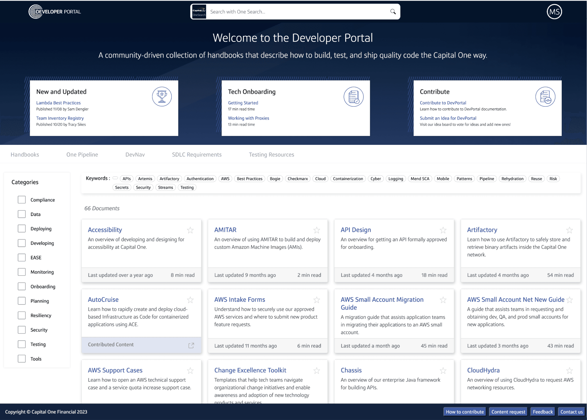
1
Lack of Top-Level Navigation
DevPortal’s unclear navigation increased cognitive load, leading to repeated searches and excessive clicks
2
No clear entry points to critical sections.
DevPortal did not provide quick access to important, often-used articles, forcing users to navigate through multiple layers.
3
Hidden reference documentation
Key reference documentation was buried, making it difficult to find and use essential information.
4
Docs are split across different areas and searches.
This made it harder for users to find relevant information quickly and added unnecessary friction
Content Pages
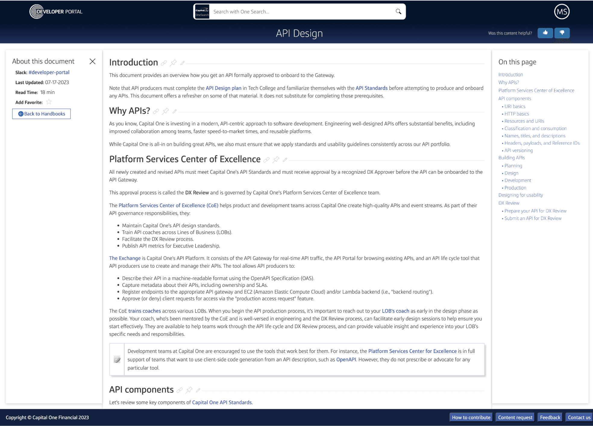
1
Lack of breadcrumbs
The lack of breadcrumbs confused users about their location in the platform’s hierarchy, making navigation back more difficult.
2
Inadequate visual chunking
Makes content difficult to scan and read. Lengthy content is difficult to navigate and easy to lose your place in
3
Limited feedback
Current user feedback methods only provide directional feedback, without specifics on what needs to be fixed.
Search Results

1
Unclear filter placement
Filters are listed specifically and is unclear where they go exactly
2
Undefined disposition tags
Disposition tags lack explanations, making it unclear to users what they represent and how they should be used.
3
Lack of advanced search tools
There are no tools available to help users prioritize and refine search results beyond basic filters, making it harder to find relevant information efficiently.
4
Unclear search prioritization
DevPortal content is not displayed initially upon search despite the search being conducted in DevPortal
5
Inconsistent sizing and crowded layout
Inconsistent sizing and minimal negative space make entries harder to read, scan, and process efficiently.
IDEATION
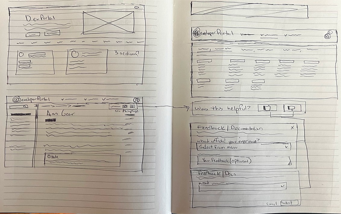
Sketching out the interface
With a clear understanding of the pain points, I began exploring solutions that directly addressed user challengers. I brainstormed multiple approaches, focusing on creating design that were both intuitive and impactful, always prioritizing the user experience.
To bring there ideas to life, I created rough UI sketches allowed me to quickly iterate, experiment with layouts and interactions, and identify opportunities for improvement, laying the groundwork for refined prototypes.


DESIGN DECISIONS
Connecting pain points to solutions
After understanding the pain points and sketching some screens to, I had a foundation on how to provide a solution and what screens to make.
Don't make me think.
Users keep saying documentation is hard to find, unreliable, and unclear—especially without a clear "start here" guide for navigation and key concepts.
SOLUTION: PROMINENT SEARCH
Placing a prominent search field in the hero section with an AI assistant allows users to quickly find relevant content without excessive clicks or manual searching. The AI enhances discovery by surfacing the most relevant results based on user queries.
SOLUTION: TOP-NAVIGATION
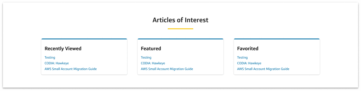
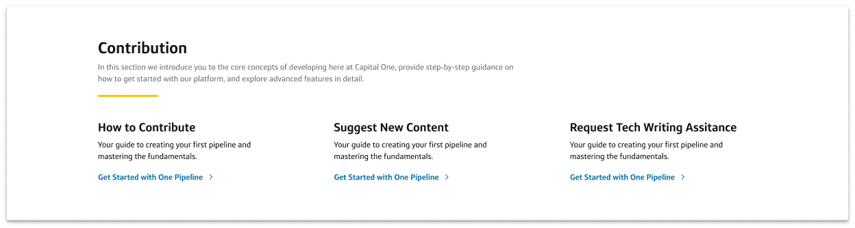
SOLUTION: KEY JUMP-OFF POINTS
New to Capital One for onboarding, a Contribution Section to drive engagement, and Recently Viewed, Favorited, and Trending Articles for quick content access, ensuring a seamless user experience.

Let me focus on building, not searching
The current documentation feels outdated and lacks the intuitive, high-quality standards seen in industry-leading platforms. Instead of a seamless, frictionless experience, developers face unnecessary roadblocks that slow them down.
SOLUTION: ARCTICLE-LEVEL COMMENTING
A comments feature makes docs interactive, enabling developers to share insights, troubleshoot issues, and highlight gaps in real time, improving clarity and collaboration.
SOLUTION: ARCTICLE-LEVEL NAVIGATION AND WAYFINDING
A left-side nav, table of contents, and breadcrumbs make it easy for developers to find what they need without getting lost. The left nav keeps everything organized, the table of contents helps jump to key sections, and breadcrumbs make backtracking simple, keeping navigation smooth and frustration-free.

Don’t make me second-guess my clicks
The prior search experience did not support users in finding what they needed efficiently and caused confusion, frustration, and wasted time.
SOLUTION: CONTEXTUAL INFORMATION
Showing information, in the moment, when users need it, so they don’t have to click around guessing. It keeps things smooth and frustration-free, especially with our large developer documentation database.
SOLUTION: CHUNKED OUT SEARCH RESULTS
Spacious, well-chunked search results make scanning easier by preventing information overload. Clear separation helps key details stand out, so developers can quickly spot what they need without digging through clutter.
FEEDBACK FRAMEWORK
Measuring success
In order to determine if our work was impactful, we needed a way to determine how well our design changes are impacting the user. We needed an approach to tracking the quality and effectiveness of an experience over time in a simple and consistent way, in alignment with both our users’ and our business goals. The most common way to do this is to leverage existing industry standard measurement frameworks.
Our team recommended the adoption of the Google HEART framework as it provides a structured, scalable, and holistic approach to measuring the success of a product or feature by focusing on key aspects of the user experience.
THE HEART FRAMEWORK PROVIDES
Comprehensive Assessment
Considers multiple dimensions of a user experience, going beyond simple metrics like page views.
User-Centric Perspective
Prioritizes user satisfaction and engagement, helping to identify areas for improvement and guiding product development decisions.
Actionable Insights
Enables the collection of both quantitative and qualitative data, helping to identify and prioritize specific areas that require attention.
Benchmarking
Allows you to establish a comprehensive baseline to measure performance and goals against.
Iterative Improvements
Allows for quick, data-driven decisions that can be implemented iteratively and then measured again using the framework to assess the impact. Rinse, repeat.
Communication & Alignment
Provides a common language and structure for discussing and evaluating the success of a product.
Goal Workshops
In the same exercise we identified signals that we could listen to in service of those goals.
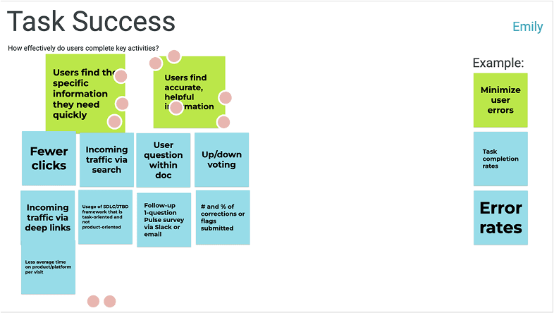

Metric Identification
Recommendation
We recommended a starting baseline of goals to measure and track the ability of developer documentation to meet users’ needs, allowing us to compare apples to apples across products.
Subject to change and intended to evolve over time.

TAKEAWAYS AND NEXT STEPS
Positive results and much more to do
The project was an overall success and had a pretty quick timeline. Due to timeline and capacity contraints, not all features could be implemented, but many of them have been added to the backlog for refinement.
The redesign of the Developer Portal has had a positive impact on the developer knowledge management experience. However, there is still additional triage needed from developers as some articles and developer documents are out of date. This is out of scope for this work, but something design can give a perspective on. How might we create an efficient way of updating docs to ensure they’re clear and telling up to date data?
At the time of writing, the new Devportal redesign has been in action for about 1 year.
Overall site traffic increased by 22%
86.6 UMUX lite score
92% of users claimed that their self-service experience improved
Support requests decreased by 11%
Thanks for reading! Looking for more?

Ensuring developers can quickly track deployments, approvals, and release statuses with ease.
Capital One - 2024