
Dexcom mobile app improvements
Improving how diabetics measure their blood sugar and make informed decisions.
OVERVIEW
Trying to improve the lives of fellow diabetics
PROJECT VISION
Being a diabetic is a part-time job. The responsibility of having to be your own pancreas is a task none of us signed up for. From having to prick your fingers to check your blood sugar levels to daily needle pokes that deliver insulin.
This is passion project of mine, as it resonates closely to who I am. I have been a diabetic since 2012 and I've been using Dexcom CGMs since late 2017. Dexcom has been focusing on their hardware – which is great, but their mobile app has been lacking. This case study highlights how improvements to the UX of the app can go a long way.
OUR GOAL
Provide a seamless & linear event management experience
Improve the way users deal with alerts and alarms
Create a better UI while keeping blood sugar management as the focus

KICKOFF
Starting off from personal experience
The purpose of this research is to explore to other’s experiences with the Continuous Glucose Monitor Dexcom G6 app. I have my own set of experiences with Dexcom g6 and their mobile app, but I wanted to conduct my own research to see if others echoed the same issues that I had.
I opted for a goal-directed design approach that helped me move along through the project smoothly. Qualitative research methods proved to be the most effective during my design process, most notably checking the Apple App Store and the Google Play Store, checking online forums such as Reddit, and usability testing sessions. Whenever we encounter an issue that we are trying to solve, it's smart to build a good foundation.
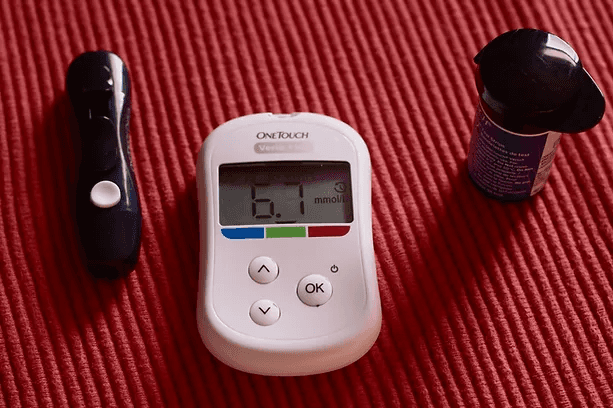
Blood glucose monitor
RESEARCH
How do people use the app in their everyday lives?
A user interview and observations through reading online forums, app reviews, and watching product reviews videos were next conducted to identify usage trends of CGM devices and/or health-management applications, priorities from the user’s perspective, knowledge gaps, frustrations, and other opportunities for design enhancement on Dexcom's current diabetes management application.
App Store Reviews
Reading user reviews from the App Store and Google Play Store allowed me to get a clear idea on the pain points a person may be having with the app. Online blogs and forums allowed me to get an unfiltered opinion, directly from the users and their opinion on Dexcom and their mobile app. Additionally forum users have a level of anonymity, which further allows people to be more truthful and canon.

Screenshots of reviews on the App Store
PRIORITIZATION
Identifying and Prioritizing Pain Points
I reviewed my observations and jotted down each user’s pain point onto a Post-It. Then I used affinity mapping to group the pain points into similar categories on a whiteboard using Miro

Grouping of known pain points
I prioritized each pain point based on its importance to the user as well as its importance to Dexcom. My assumptions of the importance to users were based on conversations with the existing users and data from my research. My assumptions of the importance to Dexcom were based on my analysis of their website and marketing materials.
Tracking, logging and editing the blood sugar data are core functions of the product and a user being able to see their blood sugar in real-time is a core feature that makes Dexcom stand out as a diabetes-related app.

Prioritization matrix
Meet the Users

PROBLEM
Defining the problem
I decided to tackle the pain points that were both important to users and Dexcom. I redefined the pain points below.
PAIN POINT 1
Users expressed the need for systems that adapt to their workflows and provide contextually relevant information
Alert at the top of the page thats contextual to the user's role (PAR Approver, ESC Approver, and Dev). This puts the CTAs front and center
PAR activity and release information now higher and detailed justification providing transparency and accountability

PAIN POINT 2
Users want a better UI while keeping blood sugar management as the focus.
Users complained that the app is great, but it is lacking many features in comparison to Dexcom’s sister app “Clarity” and other CGM-monitoring apps. Compared to the others, Dexcom looks a little underdeveloped.


PAIN POINT 3
Users are looking for an improvement in the way deal with alerts and alarms.
Dexcom prides itself on being one of the most innovative CGMs on the market and their whole “no finger pricks” value propositions is something that brings in a lot of customers.
People are always busy and managing diabetes is like a part-time job, so the alerts and notifications definitely come in handy. Where they miss the mark is how often the appear. I and users alike believe that the alarms happen too often and the functionality is a bit clunky and persistent. The alarms continue to sound even though a user has seemingly dismissed the alert.
IDEATION
Heading to the drawing board
Then it was time to start sketching. I came up with several potential solutions to each of the pain points and made some rough UI sketches.

PROTOTYPING AND VALIDATION
Bringing the concepts to life
I jumped into XD to create Hi-Fi mockups of my proposed solutions and created a clickable prototype. I tested the prototype with 4 individuals. Insights from the validation test led me to reiterate on one of the screens. Below are the Hi-Fi mockups of my final solutions including the before and after implementing my design solutions.
Pain Point 1: Users wish for a seamless & linear event management experience.
Design Solution: Expand the creation of events so that the user can intuitively add all of their different, relevant events such as what they ate, how many carbs, and even a photo of the food.

Pain Point 2: Users want a better UI while keeping blood sugar management as the focus
Design Solution: Reduce the amount of whitespace on the home screen while adding additional features and tabs for sections in which the app is lacking.

Pain Point 3: Users are looking for an improvement in the way deal with alerts and alarms.
Design Solution: Reduce the amount of times the alarms goes and disallow the app to override the alert settings.
GIF of how to remove the alerts
TAKEAWAYS & NEXT STEPS
Its was interesting to learn about how other diabetics are using one of my favorite apps.
It was interesting to see how other diabetics use an app that has become apart of my daily routine. I was curious to see why the app was so poorly rated as I believed the app was pretty decent, as it allowed me to stop pricking my fingers. I would love to run this by with Dexcom themselves as I believe some of these changes could be very impactful in a diabetic’s life.
